In this part, we are going to copy a color palette of a certain scene. So in this case, we are going to copy scene 1's color palette and will try to apply it on scene 2.
Figure 1.1 Scene 1
Figure 1.2 Scene 2
Scene 1 is more of bluish to cyan and red while Scene 2 is more of darker tint of blue and yellowish orange.
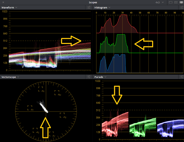
First, I'm going to tell a few things about scopes. Scopes is the visual representation of the pixel or color that we see on a clip. Scopes has four parts.
Figure 2.1
By looking at the waveform, it helps you adjust the brightness and the darkness of the scene. 0 being the absolute black while 1023 is the pure white.
Figure 2.2
Histogram can be used in evaluating exposure. Its most helpful in balancing shots and identifying any illegal luma value.
Figure 2.3
Vectorscope is useful for identifying the colors that are involved in the clip. It is also useful for correcting colors like skin tones.
Figure 2.4
RGB Parade is most helpful in addressing color balance issues. It can also help you identify which color is more and which color is less. This part is the most popular scope among colorist.
Now, let us check the scopes of both scenes and let's compare it.
Figure 2.5 Scene 1 scopes
In the waveform, we can see that both green and blue dominated giving it a cyan look. The white lines that you are seeing are the source of light in the image which you can see in the background. You can also see in the histogram that the image is balanced and the black is not crushed. In vectorscope, the strong portions is pointed directly to cyan and some red for the sunset color and also for the woman's jacket. In the RGB parade we can see that there is more green in the image and lesser red.

Figure 2.6 Scene 2 scopes
Now let's take a look at Scene 2 scopes. By looking at it you can already tell the difference between the two. As you can see, scene 2 is more darker. The waveform is almost touching 512 or in Ansel Adams Zone system, it's called medium gray. In Histogram, the colors are placed in the darker area its liked being compressed. In vectorscope, it is closer to yellow and a few of red. And in RGB parade we can tell that there is more red in the clip and blue is more darker than the others.
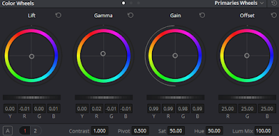
 First, we should correct the colors by dragging the gain to the right to increase brightness. Move gamma a little bit then if you noticed that you're darker areas becomes lighter, try dragging the lift to the left to make it darker. Be sure not to crushed the colors to avoid destroying the details. Crushed means that you're dragging the color to absolute 0 and beyond.
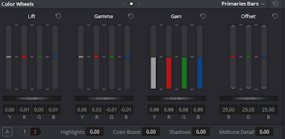
 Now here in the Primaries Bars, you can adjust the RGB colors separately. Scene 1 is more off a greenish - cyan and Scene 2 has dark blue tint with yellowish orange. So in order for you to achieved that, lessen the amount of red and increase the amount of green and blue. Usually, when you drag a certain color in lift, gamma or gain the others will also move. So for you to properly move the color without moving the others use the offset bar. You can also manage the colors in Primaries Wheels by dragging the lift circle a little bit to green, gamma to cyan and the gain to blue. I'm not saying that when you do this you'll get the result automatically. You should still move the wheels and look at the scopes until you get the desired look.
Here in the log, you can adjust the amount of the shadows, midtone and highlight. When you moved both shadows and midtone, you can see the results immediately while in highlights, it will just adjust the lighter areas.
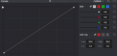
 Here is what you call curves, this part of DaVinci Resolve helps you to balance the amount of luma in your clip. Dragging it upward makes your scene brighter especially the lighter areas while dragging it downwards makes it darker especially the dark areas like shadows.
Before
So here is the result. You can the two photos together for comparison, Scene 1 is on the left while 2 is on the right. I managed to at least get the colors closer to my source. I have encountered some minor problems here namely: the image lighting is different. Scene 1 light source is from the background while Scene 2 is in the foreground, behind the talent. Another minor problem is the amount of red present in scene 1, while there are little red in scene 2.
Lastly, here is the updated scope for scene 2. The clip is originally a bit dark that's why the colors are below the medium gray, increasing the brightness will make it look less contrast and less saturation. So I decided to just focus on copying the color palette of scene 1. As you can see, now that we've copied the colors of scene one; before, scene 2 is more of a darker blue and yellowish orange, now it's more of a bluish cyan. Before the scene 2 feels warm, now it feels cooler. The vectorscope doesn't looked compressed anymore since we increased the luma by using curves, it helps in adjusting the highlights in both foreground and background.
Every time you edit make sure that you're taking advantage of the scopes, because it will help you in identifying the colors and tracing it so you could correct it.


No comments:
Post a Comment