

Before,After
Before the image looks pale and less contrast. I did some simple ways to make it more lively. I balanced the image first then increased the amount of saturation a little bit then also increase the color boost. Color boost is some what similar to saturation; as the name suggest, it boost the color to make it more strong. I applied just the right amount of boosting, don't over do it because it will crushed the colors and will make it noisy. I then used the qualifier on the sky and dragged both gamma and gain a little to blue to make it look like it's morning.

Before,After
Since the task was to make the film look natural, In this sample, I just did some simple steps to achieved it. I lower the amount of lift to give depth to the shadows or the darker areas, then increase both gamma and gain a bit. I also increase the contrast a little. I dragged the highlights down a little so that it won't crushed the brighter parts of the scene especially the building at the background. Then I increase the color boost to enhance the present colors in the scene.


Before,After
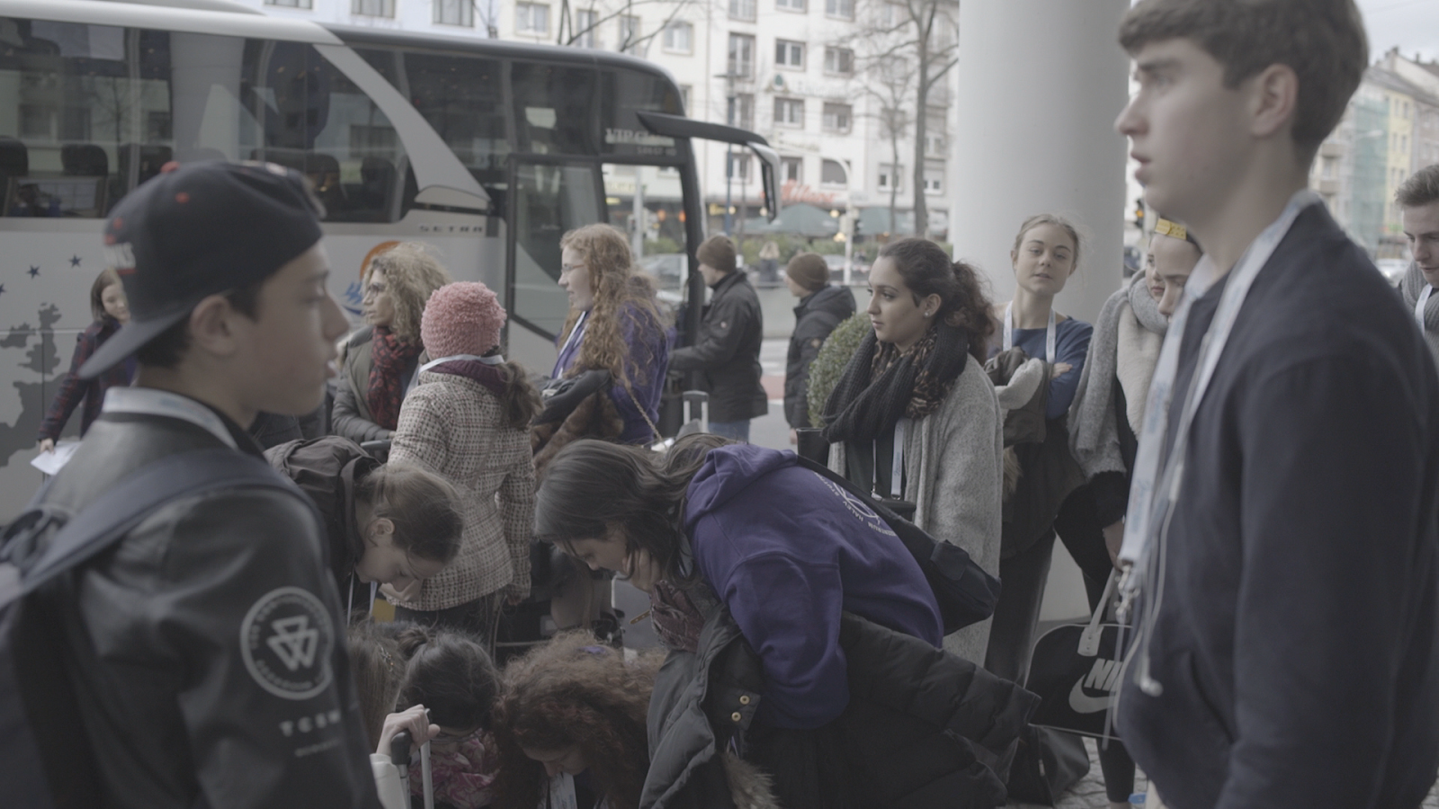
In this example, It's a bit challenging because there are times that the skintones looks more yellowish and not natural. What I did is I increased the luma to lighten the image then increased the highlights and color boost a little. I lower the amount of shadows and increased the amount of contrast and saturation. Then added a little yellowish/orange tint to it. It looks appealing now than before.


Before,After
This scene is not difficult to grade since it was shot inside where the lights are mostly blue. I increased the amount of saturation on this one to strengthen the color. I increased the highlights and contrast so that it won't look flat then lower the shadow as well. I make sure that the colors from the object that she's holding is emphasize since it changes colors.


Before, After
I did a little balance on this one. I increased the highlights a little then also increased the amount of color boost, contrast, luma and saturation to make it more colorful and appealing to the eyes of the viewers. Before it looks really sad and a bit de-saturated, now it's more fun and entertaining.
No comments:
Post a Comment