Tuesday, May 31, 2016

Eye Training


RAW - MY VERSION - GRADED

Example 1:


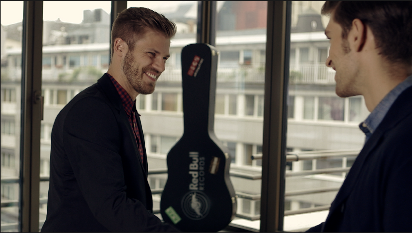
     At first, it seems hard to recreate these styles or looks because first of all, I don't know what specific software the colorist used to achieved these styles. But I'm glad to at least get almost the similar results. It's not 100 percent the same though. For this example, I used a lot of nodes because I don't want my grades or work flow to mixed on a single node.

Example 2:


     For this example, I balanced the over all image first then added some warm tones. I also darkened the image a bit and added some blues/green to both the shadows and the lift. I isolated her skin tones so I could give it a little more brightness. I also added some blur effect on her skin and some orange/red to make her look more alive.

Example 3:


     This example is a bit tricky. After balancing the image, I lowered down the curves to make the feeling similar to my reference. Then I added some blues tones, green tint in lift and a blue tint in highlights. I also added some orange in its midtones.


So these are the new sets of eye training that I've done. I can say that I'm progressing with these and I'm learning a lot as a colorist, I actually starting to get faster in grading so that's a good sign. Thanks


Scenes belongs to:


Monday, May 30, 2016

Grading

     For this entry, I'll be showing you a few of the grades I have created.

Before - After
 

     As you can see, it's the same scene from my previous post.  But this time, I applied different grading on this one. My goal is to make it look interesting and a bit edgy since it was shot in Cambodia. I wanted it to have that ruins kind of look/feel.

     The very first thing I did to achieve this kind of look is I balance the image first. Then I added some warm tones and some green tint. I added some blue to the temperature so it wouldn't look too greenish and then I increased the lift a bit and added a little magenta to it. The next thing I did is I adjusted the luminance of the image using curves then I added a vignette and a Power window to brighten the child.


Before - After


     I wanted this scene to look very interesting with a bit of strong colors but not too saturated. For the primary color correction I did is first, I balanced the image to get that right amount of blacks and whites. Then  I added some blue tones to give more colors to the sky. I added some orange and teal colors as well to balance it without over-grading it. 

     For the secondary color correction, I added more blues and orange and teal to make the sky and ocean look cerulean. I added orange to gamma to balance the amounts of blue. I then added a vignette and decreased the amount of shadows and increased the amount of highlights. I added more orange to gamma and increased the amount of the overall contrast. Lastly, I brighten the whole image using the curves.

Friday, May 27, 2016

Color Grading


Original image

(credits to the owner)

The original image looks neutral, though the blacks are not that black.

Grade 1 : Davinci Resolve 12.5
     

     For this, I tried to do the sin city look again. I did some few steps in here to achieve this look. First, I desaturated the picture then I adjusted the amount of contrast and midtone details. The next thing I did is I added a parallel node. It's for the blur and sharp effect of the entire image. Then I increased the amount of highlights and the dark parts using the curves.

Grade 2
3D Lut Creator to Davinci Resolve


     I tried to use the same photo for the LUT creator. I just did the basic way of grading, like adjusting the contrast and saturation. Then I used some random curves until I found the desired look that I want. The next thing I did is I took a screenshot of the image and then import it to davinci. I make other additional adjustments there. I increased the contrast a bit and fixed the luminance using curves. I also added a little orange to the skin using gain and some blue/green and warms tones to the shadows and lift.

Thursday, May 26, 2016

Color Grading Breakdown


Original Image


A.) This is the original image as seen above this post
B.) I increased the amount of luminance in here using the curves.
C.) I increased the color boost and added a little bit of saturation
D.) I lowered down the gain 
E.) In here I added some bluish temperature to balance the image.
F.) I also added some warm temperature and a little green tint on this one.
G.) Lastly, I fixed the the entire image using curves. I also increased the amount of highlights on the last part.

AFTER IMAGE

I wanted it to look somewhat dark and I also wanted the midtone details to pop out a bit so it wouldn't look boring.

Tuesday, May 24, 2016

3D Lut creator pt3


     Grading with 3D Lut Creator

     For the past few weeks I've been using this software so I could be familiarize on how things works. The image below is a sample of my work.


     I did some minor grading here. I emphasize the sky, trees and the sand by increasing the amount of saturation and also the contrast. What I did first is I arranged the image using the tools below. Then, I started tweaking the A/B until I get the desired look that I wanted to see. I also did some adjustments with RGB curves (not in the image).

BEFORE - AFTER 


     Here is how it looks like before grading and after the grade. The grade that I have done makes the scene more lively and pleasing than before.

      Color Matching


     I've talked about color matching before. Here in this example above, I used both the graded and the ungraded version of this image (not my photo). The graded versions is the one on the left under reference while the ungraded is the one on the right. I used the same image to color match so I could see if there are differences or not. When I pressed command + m (short cut key for matching) a new window appeared, and I didn't get the result quickly.

The new window looks like this.


     You may not get the results quickly but you have to tweaked the tools until you get the similar results. I tried every method until I got the look closest to my reference then after that, I started fixing the image using the analysis and the matching. As you can see on the image above, both pictures looks the same.

Monday, May 23, 2016

Eye Training


Hey guys, so here are the new set of eye training that I have done for today.

RAW - MY VERSION - GRADED VERSION


     At first, I couldn't figure out how to recreate the look. I isolated the skin first and added some orange to it then I increased the temperature to blue. After that, I increased the contrast to achieve the dark look. I also added a vignette and a power window to the guy. Lastly, I added some blue but I think my final look is more greener that the graded version I'm copying. It's a bit difficult because I'm trying to add colors without affecting the white bars that much.


     After balancing the image, I increased the amount of contrast and lower the gain and lift. Then I decreased the saturation a bit and added some blue and green tones to enhance the color of the suit. I play around with the RGB curve to add a little green to it then I increased again the amount of the contrast. I then put a vignette to darken the elements around. I also increased the amount of saturation then select some colors and lessen it so it wouldn't look so strong. Finally, I added some warm tones to it. 


     For this one, I feel like it's almost the same. I'm trying to figure out this one as well, on how did the colorist managed to achieved this look. As you can see, it's not just dragging the gain to blue. First, I balanced the image. Then I dragged the gamma to blue and the gain to orange to make it look like orange and teal. After that, I added a little blue temp and green tint. I dragged down the brighter parts using the curves then I add another blue tones by dragging the gain to blue and adding a little green to the gamma. To make it look more darker, I decreased the saturation and increased the amount of contrast, I also added a little orange to the highlights so he wouldn't look pale and blue to the lift to make the darker areas more sharper. And lastly, I selected the brighter parts and increased it a bit to give a little shine to the face.


Friday, May 20, 2016

LUT creator vs. Davinci Resolve


     For this entry, I tried to do the same looks using the same image but with different programs.


This is my reference image from google (Sin City)

3D LUT Creator


     As you can see, the image above is a little flatter. The red color has lesser contrast. This one looks like a plain black and white photo with a desaturated red color in the middle. First of all, I'm still not that familiar with the tools of the lut creator. I'm still trying to figure out how things work in this program. I managed to isolate the shirt but I can't seem to increase it's saturation without affecting the whole image. I also can't find a way to enhance the details more.

Davinci Resolve


     If you compare this image to my reference photo, it's more similar than the one created using the LUT creator. I'm more comfortable using davinci because I'm already familiar with the software and how things work. The red is more darker, the blacks and whites are more stronger and the details are more sharper. I like how every details in this photo pops out.


     It's understandable that I wasn't able to do the same with the lut creator. I really need to learn more and maybe in a not so distant future I will be able to do more than just this lol. This post is not about which software is the best for grading because as you can see, I'm not familiar (yet) with the lut creator. It's about comparing my grades using two different softwares based on the things that I've learned so far. I think I can do more if I get used to using the creator.


Thursday, May 19, 2016

3D LUT Creator pt2


     And so we're back with the LUT creator. On my previous entry, I was using a demo version of the program. Now we have the full version and I'm excited, though I still don't get some of the parts but I'm starting to get used to it. I like it when you are making luts and you have the ability to save them and store them to your lut folder or somewhere. Before, I can't do that.

     I played around with this program as I was trying to familiarized myself with the tools. The "model" part is still as confusing and complicated as it is. I'm trying to watch some youtube tutorials that might help me understand the program. 

LUT MATCHING


     3D Lut creator has this feature where you can copy the luts/looks/style of a certain scene or picture and apply it to your image. I tried doing that with the examples above. The image on the left is from google and I used it as my reference image where I applied its look to the image on the right by pressing ctrl + m. Then another window will appear were you can tweak it a bit. I think the images looks similar but not totally the same because the one on the left is darker then the one on the right.

BEFORE - AFTER


     This one I graded using the program. I balanced the image first by tweaking the contrast, brightness and saturation. Then I added some orange/green tint. After that, I selected the red ribbon to lessen the saturation and the skin to make her look lively. I also used some curves to adjust the over all image.


Monday, May 16, 2016

Color grading Breakdown 3


BEFORE - AFTER


     The first thing I did in here is I used the curves to increased the brightness of the image. I then adjusted the gamma and midtones of the image to enhance the details so that I won't look flat. I used curves again to specifically darken the background without affecting the woman. Then I used a power window to give a little lightness to here. I used a third curve to enhance more the background and the foreground. Lastly, I used 2 power windows to make her eyes standout.

                                                                  BEFORE - AFTER


     For this one, I wanted it to look like an old offie. What I did is I balanced the image first, then I used both temperature (yellow) and tint (green) as the base color. Then I used gamma and gain to add more colors to it. I increased the shadows and contrast a bit to sharpen the darker areas then I used color boost to increase the amount of colors present. I also put some little blue on the lift/shadows. Then I decreased some skin color because it was too strong. Then, I added a little blue highlights to avoid making it all yellow-ish.
BEFORE - AFTER


     This scene, I wanted it look like a (almost)night scene with dramatic blue tones. To do that, I balance the image first. Then I addd (blue) temperature and a little (green) tint as the base colors. Next, I decreased the curves and wheels to give it a dark feel. Then I added a new set of blue tones using Log and Primaries. I darkened the image for the second time (same process) like the first and make a few adjustments like increasing the amount of contrast and lastly, I added a vignette to it.

BEFORE - AFTER


     For this scene, I wanted it to look lively since it has so many different colors to it. After balancing the image, I increased the curves to brighten it up since the raw image looks dark. Then I added a little warm tones using temperature and tint. I used Hue vs Sat to specifically decrease the amount of red because it's over saturated. After that, I added some blues to make it look natural then increased the curves again to brighten it more then I added a vignette at the last part.
   

Friday, May 13, 2016

Color Grading Breakdown 2


Ungraded flat image:


Nodes:


     Balance the image first. LTSH (lift, temperature, shadows and highlights) are for base coloring. I adjusted the skin tone a little bit to lessen the yellow color from the temperature. TSATC (tint, saturation and contrast) are for secondary color correction. I used curves to specifically fixed the brightness on some parts without affecting the whole clip. I isolated the sky using the color qualifier and adjusted the colors to make it blue. The reason why I didn't qualify it first it's because there are some noise from the background. I decided to fix it first before I proceed. I increased the saturation to make lively and colorful. The next thing I did is I added some yellow tint (yt) on the image to make it look warmer. Then I added a vignette. Lastly, I did some minor adjustments using primary and log grade, and curves to further enhance the image.

Result:

Thursday, May 12, 2016

Color Grading Breakdown


Ungraded image:


     This are the nodes I used, as you can see I labeled them one by one so that I wouldn't forget the process that I've done. 


A.) This is the ungraded footage of the project. The full picture of the before image is the one you see at the top of this entry. As you can see, it's flat, too bright and less contrast and saturation.

B.) The first thing I usually do when grading is to balance the image. I adjusted the contrast and curves until I get the right amount of whites and blacks. 

C.) I increased the amount of saturation a little bit to give it life to it and to the elements of the scene.

D.) I isolated the sky using the qualifier so that I could change the colors without affecting the other parts of the image. make sure that when you use the qualifier, the parts that you want to select are the only ones you want to edit. Sometimes, it affects other parts with the same color value. I also used power windows so I can focus on the sky only.

E.) LTSH means Lift, Temp, Shadows and Highlights. I used Lift to darken it a little bit and to make it a little blue. I dragged the Temperature (new feature of DR 12.5) to a cool blue so it can mixed with the sky and I used Shadows  to give depth, especially to the darker parts/areas, and I lessen the amount for Highlights.

F.) By using the Hue vs Sat, I selected the skin using the color picker and dragged the color down to decrease the amount of colors on the skin because it looks strong and very saturated.

G.) TSATC means Tint, Saturation and Contrast. I added a little green Tint (also new feature) and increased the Saturation of the over all image, but not too much. Then increased the amount of Contrast to strengthen the blacks.

H.) And lastly, since the location is at the beach with a bright sun, I decided to dragged the gain to yellow to give it a warmer look. YT means yellow tint.

Tuesday, May 10, 2016

3D LUT Creator

what is a 3D LUT Creator? 

     According to 3DLut Creator it is the latest program with unique tools that you can use for professional color grading of digital images and video and creating 3DLUT-files that can be imported into many programs such as Adobe Photoshop, After Effects, Premiere pro, DaVinci Resolve and Final Cut pro.

     For the mean time, since I'm not familiar with how this program works, I just downloaded the Demo to be familiarized with every part of it. This is how the interface looks like:


     I can't explain it more because I have to do more explorations but for now, the black area on the right is were you can see the image that you are editing and the area on the left are the tools that you can use for editing. 

Here are some of the images I edited using this program:

BEFORE - AFTER

     For this image, I tried to do an orange and teal and I'm also trying to make look mysterious-fantasy-ish look

BEFORE - AFTER

Another example:


     I did some little adjustments on this one. I actually don't know how this program works at the moment. There are some parts that are too complicated and hard to understand. At first, it seems pretty easy to use and very light, but when you're using and trying to figure out what look you want to create, it's a bit of a challenge. Since it's a demo version, I can't save or export the luts. 

     For now, it a bit challenging but I believe once I understand the process on how to create luts using this program. It would be easy. The model on top is also a bit confusing to me. I think every model has a specific purpose or a specific part when grading. Hopefully in the next day, I'll be able to understand this and create luts far more greater than these ones.

Credits:

Wednesday, May 4, 2016

Look Test


TEST

     Testing your eyes by recreating looks will help you improved your ability to grade better. For me, this eye training really helps me improved my skills and widen my knowledge in color grading.  The images below are the clips used to train my eyes in re-creating colors/style. These scenes are the hardest ones to re-create for me or not really the hardest but the challenging ones.

RAW - MY VERSION - REFERENCE


     The problem I encounter with this one is the use of magenta in both shadows and midtones. The colorist managed to combined those two without affecting the over-all image. Mine's a bit purple-ish


     For this scene, the problem I encounter was the light in the helmet's eyes. There are times that It's crushed, I tried to lessen the amount of contrast and shadows to make it look the same and balanced.


I had some minor problems in grading this clip. Those minor problems are the sand and the old man.


     I also encountered some minor problems in this scene. Because the reference image is blue but you can see other details with different colors. Mine is somewhat affecting the other colors with blue. I had issues with the light as well. I can't seem to figure out how he manage to increased it's brightness.


     This one is really hard. Because I don't know how to add bulbs and flares on the images. I used power windows and blur and sharp tool to at least make it look similar to the reference. 


     For this scene, I managed to get the same feel easily. Some minor differences are the way her skin looks with the light from the torch and some color differences with background highlights.


     I know my works aren't perfect, I did give my best to achieved the same looks. For this clips, I used DaVince Resolve to re-create it and the images/scenes are from ISEEHUE (check it out for more amazing color breakdowns).